Cancel Flow
TL;DR
An interaction study on making cancellation match its actual stakes. Two ride apps make you argue your way out of a booking no driver has even accepted yet. I rebuilt the cancel flow so pressing cancel cancels.
Services
Interaction Design
Prototyping
Year
2026
The Problem
Drivers don’t reliably come to my area. So every morning my mum and I book across a few apps at once and cancel the ones that don’t win. Cancelling isn’t an edge case for us. It’s the daily cost of getting a ride at all.
The Teardown
The same two flows, side by side. Both mid-search, with no driver assigned yet.


Uber: a reason list with a literal Skip, then a confirm that says the trip was already offered to a driver.

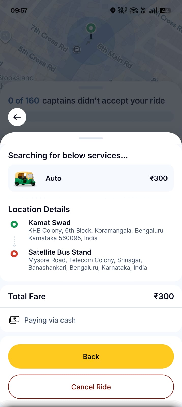
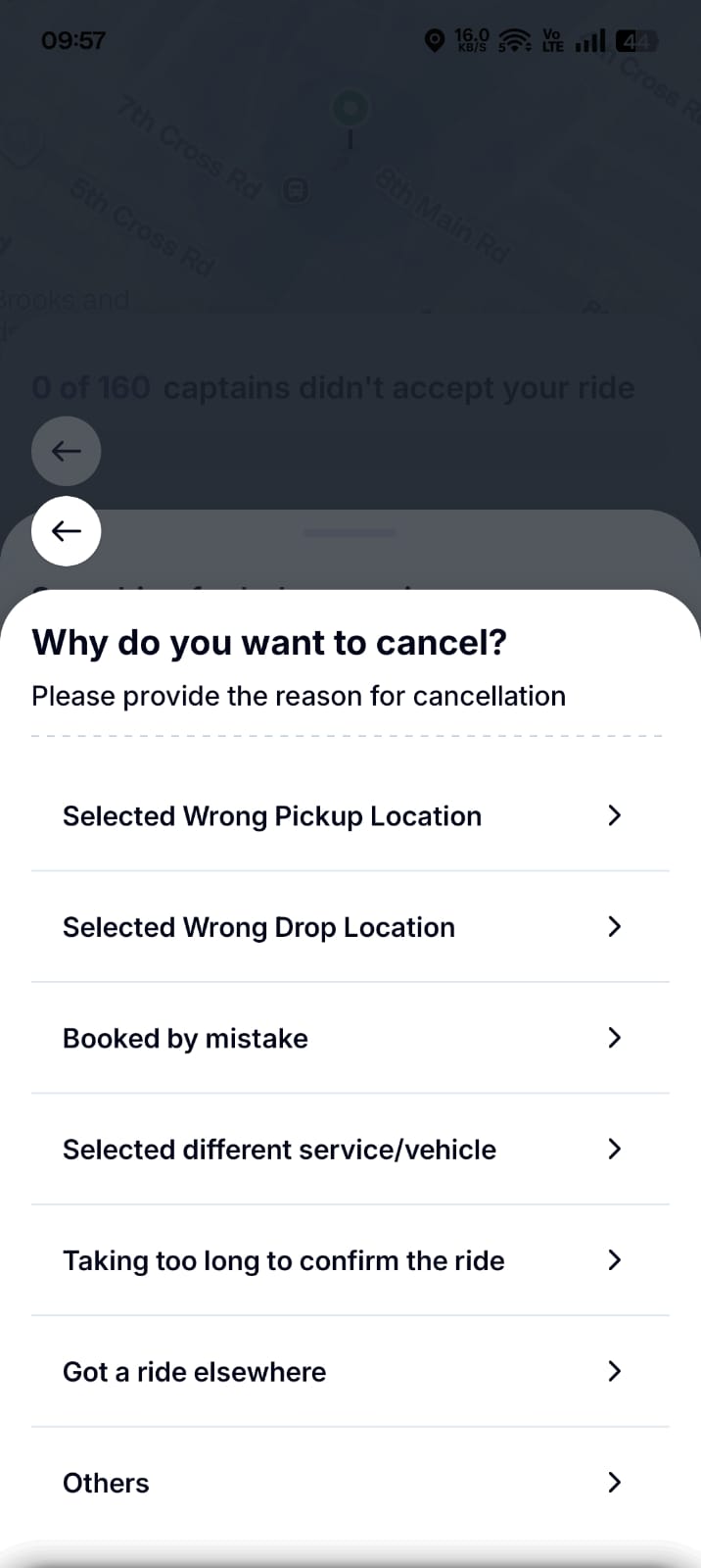
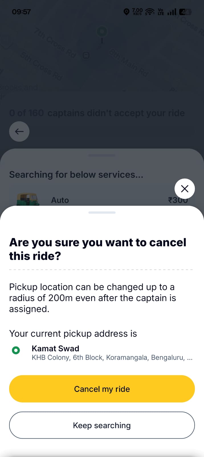
Rapido runs the same reason list, then a confirm that says captains are near you, so please wait.
The reason step is inert.
On Uber, picking a reason and skipping it both land on the same confirm screen. A step that changes nothing isn’t a decision. It’s a toll.
The friction doesn’t match the stakes.
No driver is assigned and nothing is committed, yet both apps still insert a reason screen and a guilt-worded confirm.
The weight is uniform.
Same gauntlet whether nothing has happened or a driver is already on the way.
Friction should scale with what’s actually at stake.
When no driver is assigned, cancelling costs nothing, so it should cost the user nothing.
The Solution
The card collapses the moment you press, and an undo slides up to catch it. One reversible gesture, in place of the whole argument.

Cancel commits the moment you press it. Nothing stands between the intent and the result.

A brief undo toast catches accidents. The window drains inside the pill, and that safety net replaces the gate.

The reason comes after, and it’s genuinely optional. Tap anywhere to dismiss it. There’s no skip button and no thank-you screen.
LIVE PROTOTYPE · TAP THE TRIP CARD TO RUN IT
What I Cut
I didn’t build the multi-app orchestrator. That’s a coordination problem, not an interaction one, and it isn’t buildable as a real thing. The design stays inside a single app’s cancel flow, done properly. Showing one thing in depth beats showing everything.