Delight Cards
TL;DR
Six single-card moments for the home screen of a countertop cooking robot. They show up when the app notices something about your cooking, and each one is paired here with the banner that teases it. This was a product designer assignment.
Services
Product Design
Illustration
Copywriting
Year
2026


The System
A banner appears on the home screen. One line, no picture, no hint of format. You tap it and a full-screen card opens with one observation and nothing else.
The banner is one component with different copy. A banner that changes its design to match its card gives away the format before you tap.
The cards themselves vary completely. Different ground, different palette, different illustration approach, but some underlying artstyle. What holds them together is the frame, the chrome, and the fact that none of them congratulate you.



Six banners, one component. Only the copy changes.
The Cards
Banner on the left, the card it opens on the right. Same treatment six times.
01 · Ten meals
10th meal cooked


Ten dishes on screen, so the copy never says ten. The first and the tenth sit inside the sentence that names them. The eight in between are literally in between.
02 · The poem
Mostly Indian cooking

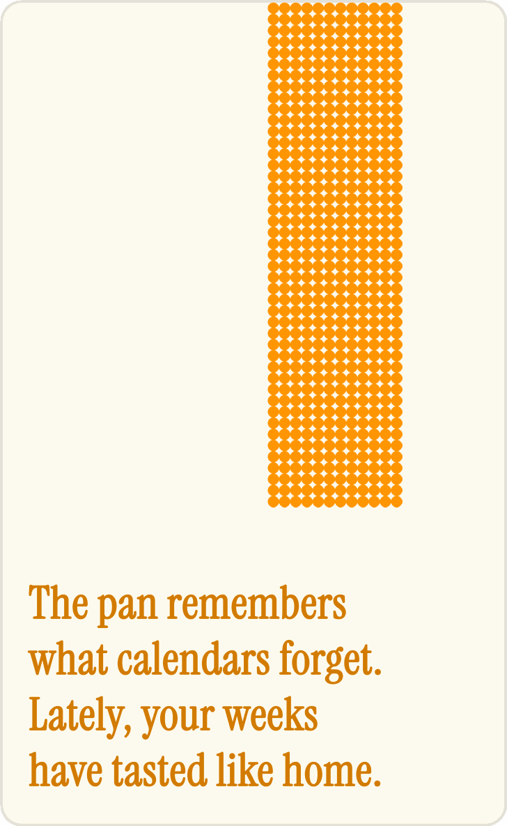
The only card with no data on it. Type carries the whole thing.
03 · Money
$346 not spent on delivery

These users spent $1,750 on the machine. A savings figure played straight is slightly absurd to them, so the number converts into evenings instead. $346 over 22 orders is about $15.70 each, which survives someone doing the division.
04 · Protein
Recent meals have 22% more protein than the first five
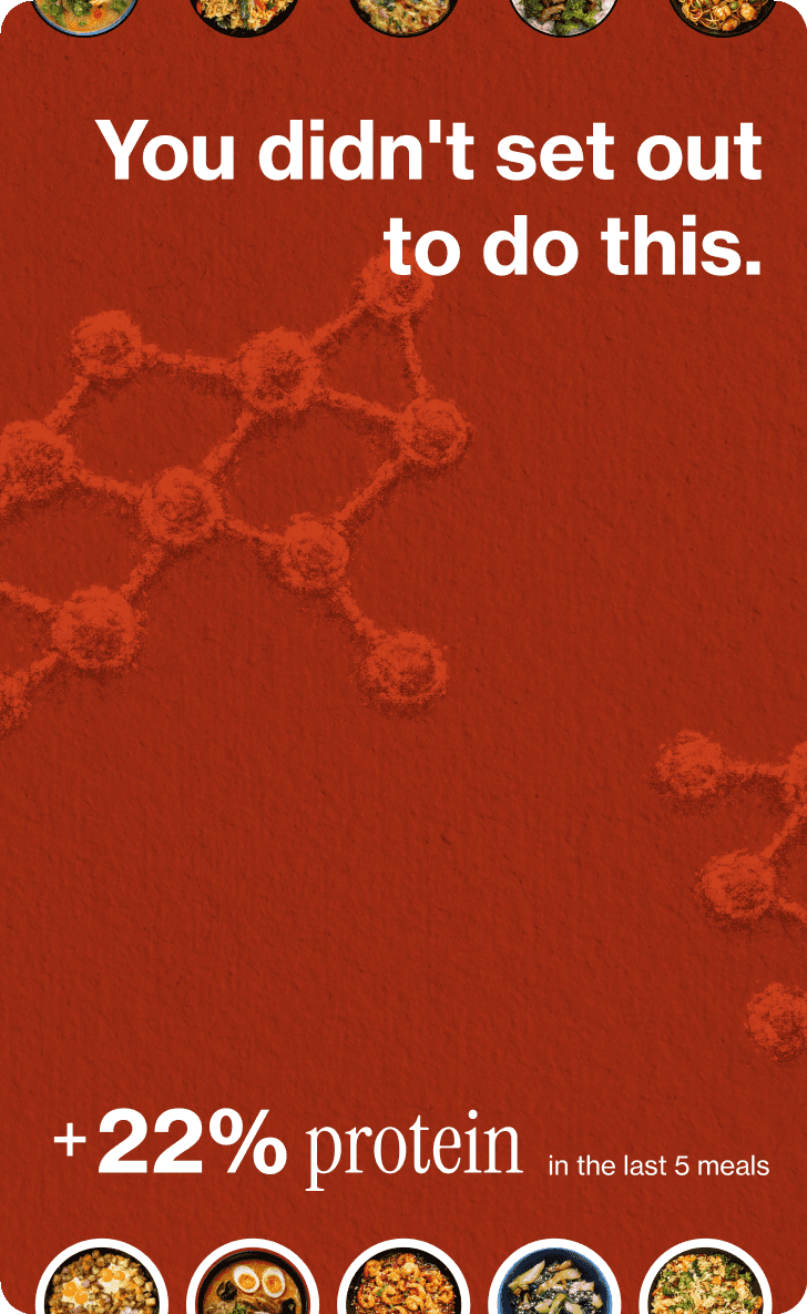
Five dishes at the top, five at the bottom, cropped by the card edge. The card itself is the before and after. The observation isn’t that protein went up, it’s that nobody decided to make it go up.
05 · The one for one
Single-portion cook, late

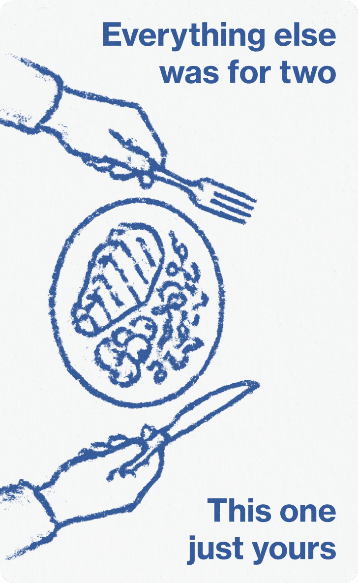
The quiet one. The app never says late, never says alone. The reader supplies both.
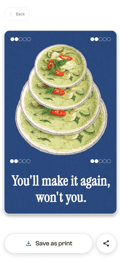
06 · Green curry
Same dish, four cooks, two stars every time


Four bowls, four ratings, all two out of five. Rating a dish two stars prompts the company to ask why, so the behaviour is real. The card just declines to ask.
Why This Direction
These are collectibles, not one template with the numbers swapped. Six cards on the same layout read as one card you’ve seen six times. Stamps, trading cards, matchbook covers, the things people actually keep, vary completely in artwork and hold together structurally instead. So the ground, palette and illustration change every card. What doesn’t change is the frame, the type, and the chrome.
Tone came from the client.
Their CEO shared a review calling the robot weird and idiotic, and noted the reviewer still uses it every Sunday. Not a company fishing for applause. So these don’t congratulate. They just notice.
Print, not app UI.
Flat colour, no gradients, no progress bars. The button says Save as print, because that’s what you’re saving.
(I wanted them printed as fridge magnets, until I read that the outer shell is aluminium.)
The data goes in the layout, so the copy can say what data can’t.
The milestone card never says ten meals, because ten dishes are already on screen. It says the first one felt like an occasion and this one was just Tuesday. A count can’t tell you that.
Idea to Pixels
Wrote all the copy first, before I opened Figma. That’s how I found out which cards had something to say and which were a mechanic looking for content.
The test for every line was whether it’d make you think, how did it know that. If anyone could work it out, it’s a statistic.
The app has a moment nobody designs for. Cook running, you’re watching a slowly updating photo of your own pot with a timer going. Twenty minutes, phone already in your hand. These belong there.
What I Cut
A card built from the stirring arm across many camera frames, arranged into a puzzle. I couldn’t find a payoff rooted in the user’s own data rather than just being a trick, so it’s out. Also a card built around a funny face spotted in the pan, but the yellow handle sits across the middle of every frame, so that one had to go too.